Handmade ceramics can bring light and character to an interior, but they can just as easily turn a home into a tourist tavern. I sort out the names and suggest where and how to lay a pattern, how to choose the colour and grout, and what to watch out for in the kitchen, the bathroom and on the terrace.
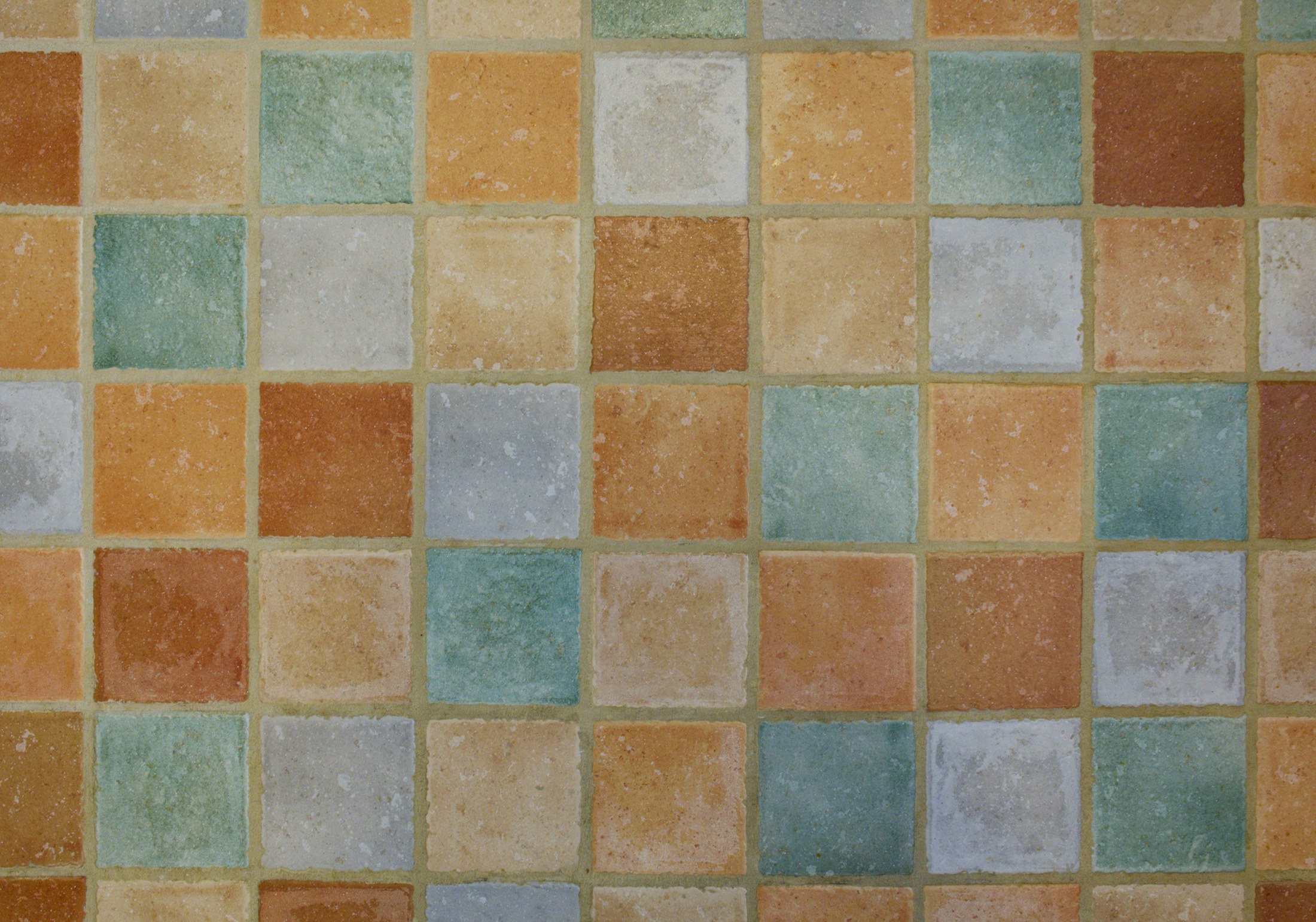
Few materials evoke the south as quickly as ceramics. A few rows of uneven, glazed tiles above the worktop are enough to give a kitchen warmth. The same ceramics laid everywhere and in every pattern have the opposite effect – instead of a home by the sea, you get restaurant decor. The difference rarely lies in the tiles themselves. What matters is the type, the scale, the grout and what we deliberately do not lay.
The word azulejo comes from Arabic (in its Andalusian variety, azzuláyǧa) and meant something like "pebble" or "smooth stone" – it does not come from azul, as is often claimed (RAE). It is a glazed ceramic tile that the Iberian Peninsula inherited from the Moorish tradition. Whole production centres grew up around it in Spain: Manises near Valencia, Seville, Talavera de la Reina – Talavera ceramics were added to UNESCO's list of intangible cultural heritage in 2019. In 15th- and 16th-century Seville, two techniques developed in turn: cuerda seca, in which the colours are separated by a dark line of greasy paste containing manganese oxide, and cuenca (arista), where the pattern is pressed into the clay, creating shallow "basins" for the glaze. Contemporary azulejos are usually tiles of around 13–15 cm per side with a painted motif – beautiful, but very bold.
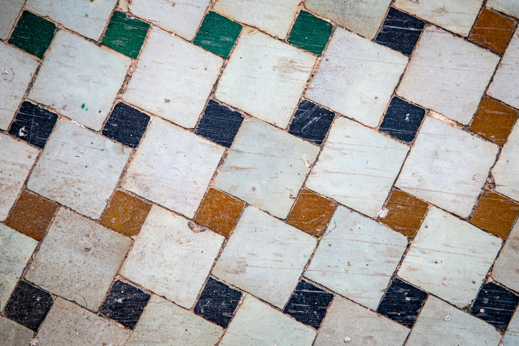
Traditional zellige (zellij) is a mosaic of small, hand-cut pieces of glazed terracotta, arranged into geometric stars and rosettes. Fez remains the most important centre of production. In catalogues today, however, the name "zellige" mainly refers to small square or rectangular tiles of hand-formed clay – or factory-made tiles that imitate them – with an uneven face, irregular edges and a play of shades. They are what give a wall that shimmering glow, which looks best in natural light.
Unglazed fired clay in colours ranging from honey to brick. On the floors of Spanish houses you will find handmade baldosas de barro, as well as the thin rasilla, traditionally used in vaults and ceilings, among other things. Terracotta is warm to the touch and ages beautifully, but it is highly absorbent – it needs sealing and periodic renewal.
They are often lumped together with ceramics, although they are not ceramic at all. Baldosa hidráulica is made from cement mortar with pigments, pressed in a mould, without firing. It became popular from the late 19th to the mid-20th century, and the most refined patterns were created in Barcelona in the Modernisme era (Ajuntament de Barcelona). It has a matt, velvety surface and deep colours, but it absorbs stains easily – it needs good sealing, and acidic cleaning products damage it.
Spain is one of the world's largest tile producers and, according to ASCER , around 94% of national output is made in the province of Castellón. Many porcelánico ranges imitating zellige or azulejos are produced there too. Porcelain stoneware has very low water absorption (up to 0.5% under EN 14411), is hard and easy to maintain. It is usually frost-resistant as well, but for outdoor use it is worth checking the technical data sheet. Its weakness can be repetitiveness: the cheapest imitations have a flat print under a perfectly even gloss – up close they look like a photograph of a tile rather than a tile.
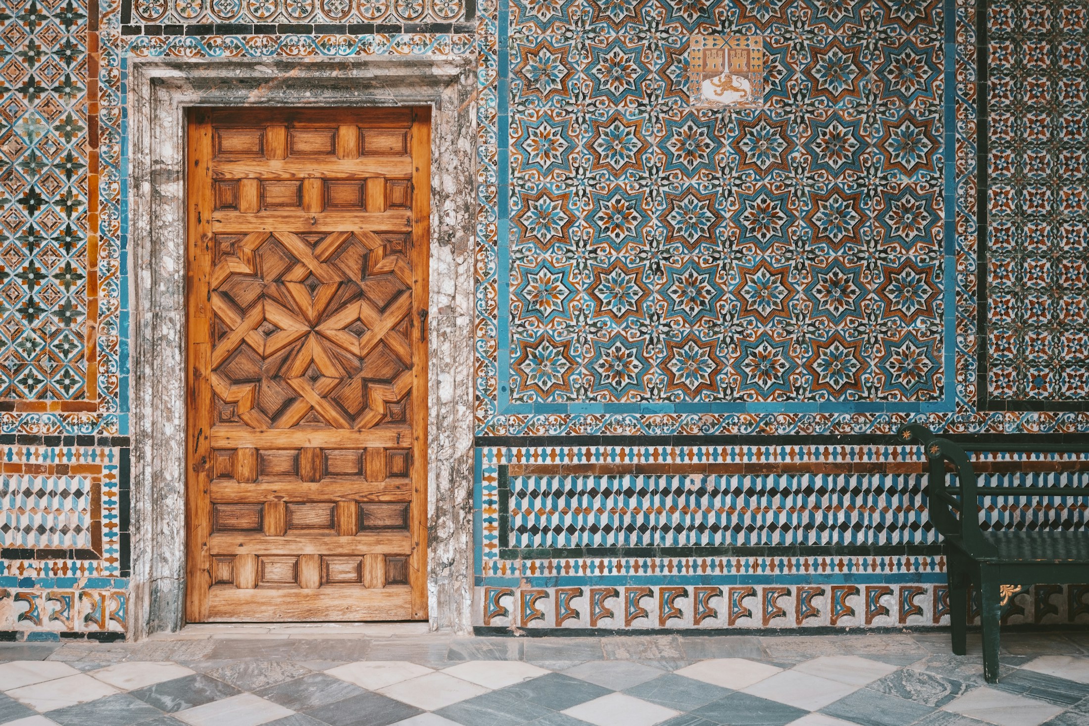
In my projects one rule applies: one surface with character per room. A patterned tile works like a painting – it needs a wall where it can hang on its own. These work well:
If the pattern is on the floor, the walls stay calm – ideally plaster. If the pattern is on the wall, the floor should be plain. Single-colour handmade zellige is a different category: it works as texture, not pattern, so it can be used over a larger area, for example throughout a wet room.
At Formentera Studio I build Mediterranean interiors on a palette taken from the landscape: sand, ochre, terracotta, olive, the off-white of lime. I recommend limiting yourself to two or three colours per room, only one of which is truly saturated. Cobalt and turquoise are beautiful, but in large doses they immediately bring holiday souvenirs to mind; in a single band of tiles by the washbasin, they look refined.
Two things that are most often forgotten:
Ceramics need a backdrop against which they can shine. The best partner is lime plaster (cal): matt, slightly uneven and breathable. In bathrooms I also like to use tadelakt – a Moroccan lime plaster compacted with a stone and sealed with soap, with a soft sheen; it works best away from areas in direct contact with running water. Microcement can be quicker to apply, but it has a more uniform, "urban" character – alongside handmade ceramics, lime usually looks more natural.
Add to that stone with a honed rather than polished finish – travertine, sandstone, marble – and wood in a natural, oiled tone. For fabrics: linen, cotton, jute, sisal. The rule is simple: the more decorative the tile, the calmer and more matt everything around it.
On the wall above the worktop, handmade tiles work well, provided the grout is easy to clean (e.g. epoxy, or sealed cement-based grout). Behind the hob it is better to avoid cement tiles and unsealed terracotta – grease soaks into them permanently.
Zellige in a shower is possible and very striking, but it calls for care: waterproofing beneath the tiles, low-absorption grout and sealing and, with a heavily crackled glaze, protection for the tile face too. On a shower floor I choose non-slip tiles – glazed zellige is slippery.
Outdoors, in a climate with frosts – always in Poland, and in Spain inland and in the mountains – you need low-absorption tiles with declared frost resistance, in practice most often porcelain stoneware. The second parameter is slip resistance. The Spanish Código Técnico de la Edificación (DB SUA) divides floors into classes 0 to 3 according to slip resistance measured with a pendulum (the Rd value); class 3 means an Rd above 45. The regulation requires class 3 in, among other places, outdoor areas, under showers and around pools – where people walk barefoot – and on pool floors up to 1.5 m deep. Formally, the requirement applies to buildings with specific uses, including hotels and other accommodation, schools, retail, offices and places of assembly, not to private houses and flats. At home I treat it as a sensible minimum, especially around a pool. In catalogues these classes are often abbreviated to C1–C3.
This is how I see a Mediterranean interior at Formentera Studio: it does not recreate decor, but uses the same materials – clay, lime, stone, linen and wood. Ceramics are one strong accent within it, not a backdrop for everything. Choose one type of tile and one surface. Go for texture rather than ornament – single-colour zellige in olive or sand often creates more atmosphere than the most intricate pattern. Leave plenty of calm, matt white around it and let the light do its work.
If you are furnishing a home in Spain or want to bring its atmosphere to Poland, order samples of a few tiles and look at them next to the plaster, worktop and wood you are planning – at different times of day. It is the cheapest way to avoid the most expensive mistake.
Information verified: 25 September 2026
Tell me about your plans – I will be happy to help you find the right direction.